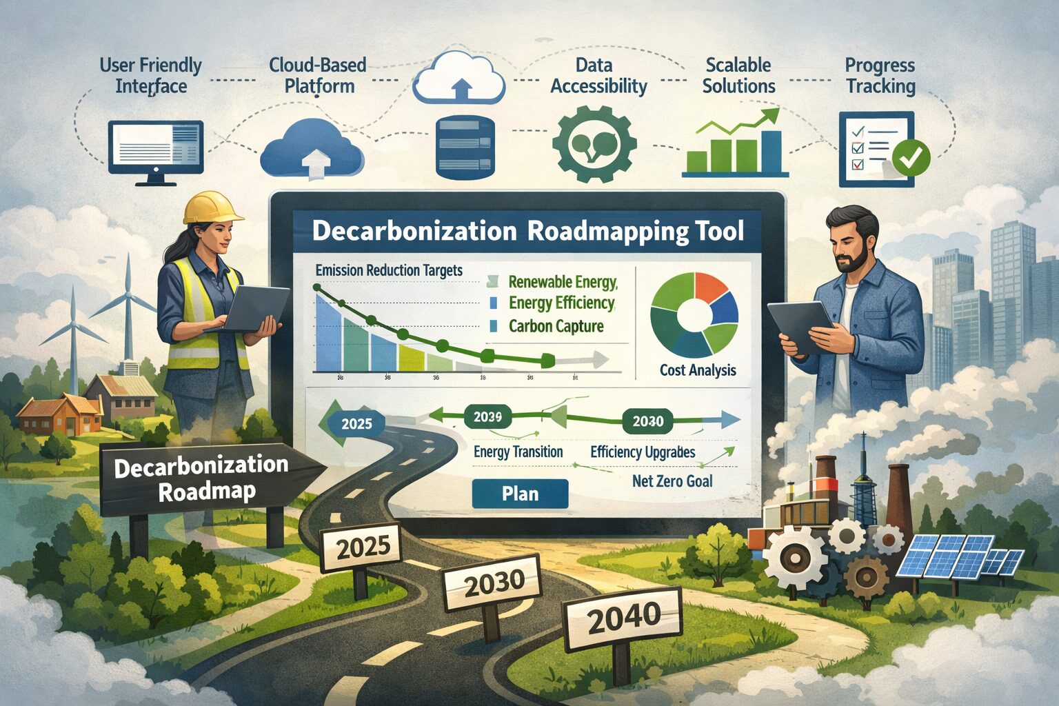
What are the key features that ensure the accessibility and scalability of decarbonization road-mapping tools, particularly in resource-constrained environments?
-Decarbonization Enthusiast
Dear Decarbonization Enthusiast,
I presented at SimBuild 2024—born out of frustration, or perhaps hope for better decarbonization tools—a talk titled “A Decarbonization Road-Mapping Tool for All: Can It Be Open-Source and Low Tech?” I explored whether the essential features of a professional decarbonization planning tool could be replicated in a more open, transparent, and resource-light format. In this context, a “decarbonization tool” would refer to a combination of calculations, graphics and narratives that convey the impact of various strategies, either for one building or a portfolio of buildings, to chart a path to carbon neutrality in the future. A tool such as described, should ideally encompass the energy/carbon emissions impact of strategies as well as soft cost (operational, behavioral etc.) and hard cost (capital cost of equipment or construction) to provide a holistic picture of what a decarbonization pathway looks like. The exercise compared commercial and academic tools—ICF’s COSight, E3’s Pathways, CREEM, RETScreen, and Carbonsight—against the everyday spreadsheet workflows still used by most practitioners. The findings reveal both the shortcomings of “low-tech” approaches and the key ingredients needed for any tool to scale across contexts. The schematic image below attempts at demonstrating greenhouse gas emissions cost over time of various strategies (A,B,C) and restacking them over time in the context of emission factors (EF) and fuel costs ($/E) to illustrate how quickly the analysis of the future can become complex and tricky.
1. Fit for Scale: From Buildings to Portfolios
The first requirement for accessibility is scalability. A decarbonization tool must function at both building and portfolio levels, letting users zoom between sites and timescales without losing coherence. Planning often begins with one building but soon expands into multi-site strategies. Tools that can aggregate site/portfolio data such as thermal plants energy and capacity constraints while maintaining unique baselines, timelines, and project stacks are essential. Most spreadsheet-based tools fail here—they cannot manage dynamic data or visualization across many properties without complex scripting or databases. A scalable architecture should, at minimum, allow users to:
- Define emissions and energy baselines at the asset level.
- Combine results into organizational or jurisdictional roll-ups.
- Adjust assumptions consistently across assets, such as emission factors or fuel price trajectories.
- Results being available from hourly to annual aggregates could be a key feature for the planner/designer who needs to dive into details and define measurable projects.
The image below shows the partial struggle with the spreadsheet problem and some of the inputs and strategy/measure implementation!
2. Integrated and Transparent Data Foundations
Accessibility is not just about price—it’s also about clarity. Many commercial platforms hide the logic behind emission factors, fuel prices, and escalation models. A truly accessible tool should integrate these parameters transparently and allow users to update them locally. For example:
- Emission factors should be editable to reflect regional grid changes. Grid emissions factors in units such as metric ton CO2-equivalent per MWh electricity delivered and various future grid electrification scenarios from sources such as NREL Cambium are great examples.
- Future cost projections per energy unit (electricity, gas, district energy) should be linked to publicly available data such as EIA Annual Outlook.
- Users should be able to apply project-specific adjustments—such as partial electrification or retrofit timing—to see realistic trajectories.
Without this flexibility, tools risk producing misleading “black box” outputs that cannot be validated or tailored to local contexts.
3. Project Stacking and Scenario Communication
Decarbonization is not a single decision; it’s a sequence of interventions over time. Tools must therefore support project stacking—the ability to combine retrofit measures, fuel-switching actions, and renewable integrations into cumulative scenarios. This also implies clear communication: users need to visualize not only energy and carbon outcomes, but also financial implications and timeline dependencies. An effective tool:
- Models both energy and financial metrics in a unified timeline.
- Allows stacking of multiple projects to see interactions and diminishing returns.
- Provides visual outputs suitable for executives, policymakers, and technical teams alike.
This feature is often underdeveloped in spreadsheets and overcomplicated in enterprise tools. The middle ground—a modular, visual, and scenario-driven approach—is what makes a solution both accessible and scalable (example of measure stacking in different years provided below).
4. Beyond Spreadsheets: Why “Low-Tech” Isn’t Always Accessible
“Excel does not cut it”. While spreadsheets are widely available and familiar, they are not inherently scalable or error-resistant. Complex macros, static references, and version control issues often make them less accessible in practice—especially for teams collaborating across disciplines or geographies.
Accessibility, therefore, doesn’t mean primitive; it means lightweight, modular, and open. The best candidates are browser-based, open-data tools with built-in validation and clear documentation—what might be called “low friction,” not low tech. Open-source frameworks can help, but they must come with strong governance and community participation to remain reliable.
5. The “Middle Ground”: Pairing Simplicity with Vision
Ultimately, the question of whether a decarbonization road-mapping tool can be both open-source and low tech can be answered with a resounding no. Not because openness or simplicity are unworthy, but because meaningful planning demands continuous data integration, dynamic modeling (changes in annual plans not time transient), and version control—beyond what static spreadsheets offer.
The path forward lies in a middle ground: tools that are affordable, transparent, and interoperable, built by software teams co-developing with practitioners. Bridging the gap between commercial sophistication and open accessibility will empower resource-constrained users to act decisively, confident in their data and options.
Closing Thought
Decarbonization is as much a data problem as it is an engineering one. Making it accessible means designing tools that think like the people who use them—simple on the surface, rigorous underneath, and capable of growing with the challenge.

Amir Rezaei, PhD, BEMP
Simulation Team Lead, Cyclone Energy Group
As Simulation Team Leader, Amir is responsible for delivering high quality deliverables to our clients, setting an exemplary standard of care while meeting the needs of our diverse clientele, nationally and internationally. A self-proclaimed data geek and visual thinker, Amir combines more than a decade of energy engineering experience and storytelling techniques to translate highly technical building science principles to actionable steps on high performing projects of all scales. He is best known for bringing technical ideas to the table and complementing a design team’s efforts by presenting compelling stories, backed by simulation tools, allowing clients to make informed decisions with the speed of design. Additionally, Amir is a compassionate manager with a keen interest in lean practices for business operations and enjoys nurturing high performance teams.